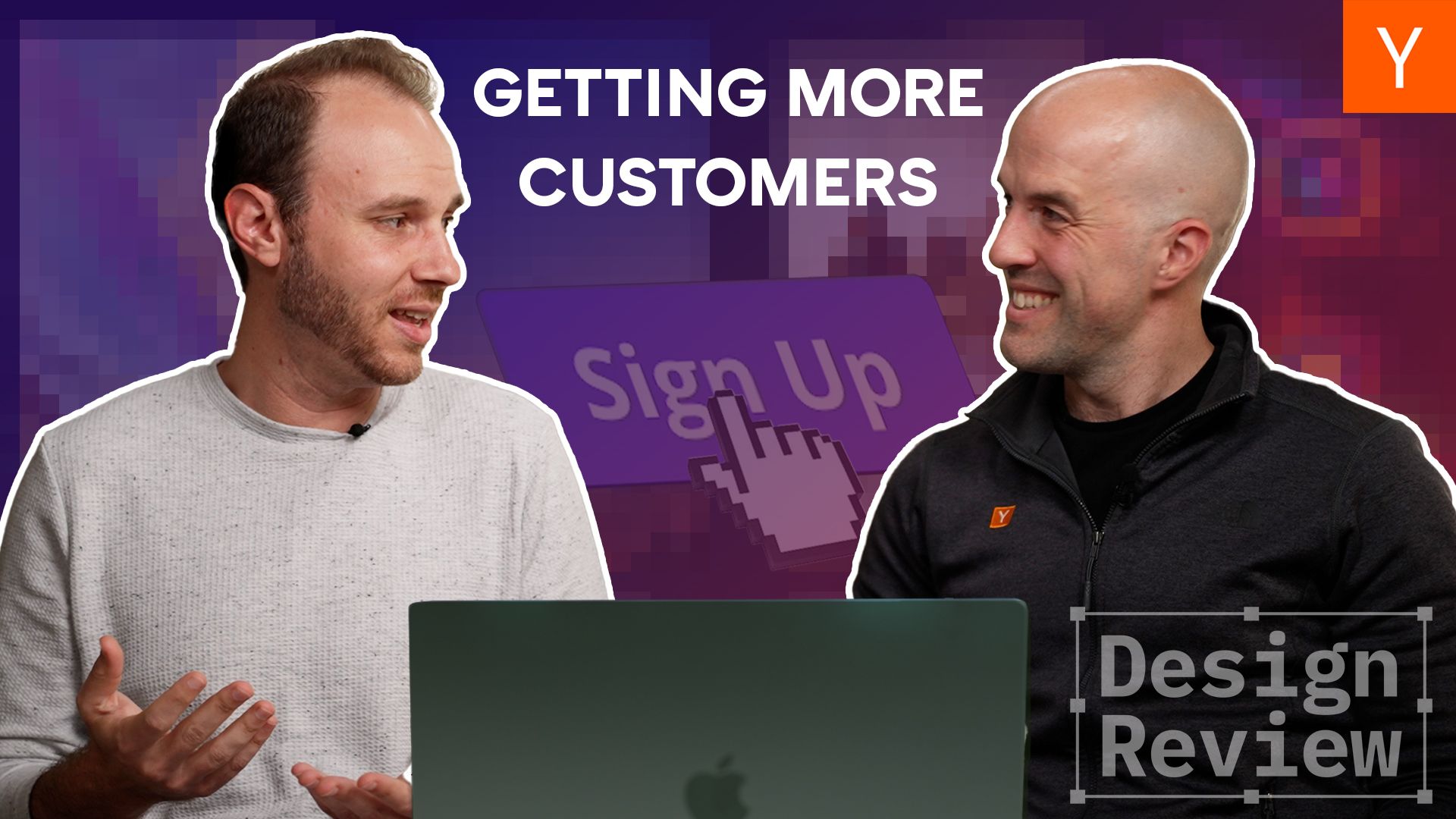
Getting people to visit your startup’s website is just step one. Getting them to actually sign up, buy something, or even just care to learn more is a whole different challenge — and it’s one where good design is crucial.
For this episode of Design Review, Aaron Epstein is joined by YC’s newest Group Partner, Pete Koomen, to cover some of the seemingly small things in a page’s design that can ultimately have huge impacts. Pete knows a thing or two about this subject; before joining YC, he was a co-founder of Optimizely, which helps thousands of companies run tests to figure out which potential design changes work best.
They’ll cover topics like:
- Giving the visitor one clear call to action and avoiding things that might compete for their attention
- Looking at every step in the experience to get visitors to the “Aha!” moment faster — or understand where you’re losing them
- How product demos can sometimes make things more confusing
- Why you probably want to avoid animated slides on your landing page
- Ways to reduce friction in the signup process to get more people signed up
The YC startups that volunteered for this episode are Rivet, Decoherence, Solve Intelligence, and InEvent. Click any of those company names to find out what each is working on — or gauge how well their designs resonate with you by figuring that out as you watch!
Find more episodes of Design Review right here.
Originally published on Y Combinator : Original article